Jan 2026
Shift Shades
Shift Shades
Shift Shades
Shift Shades
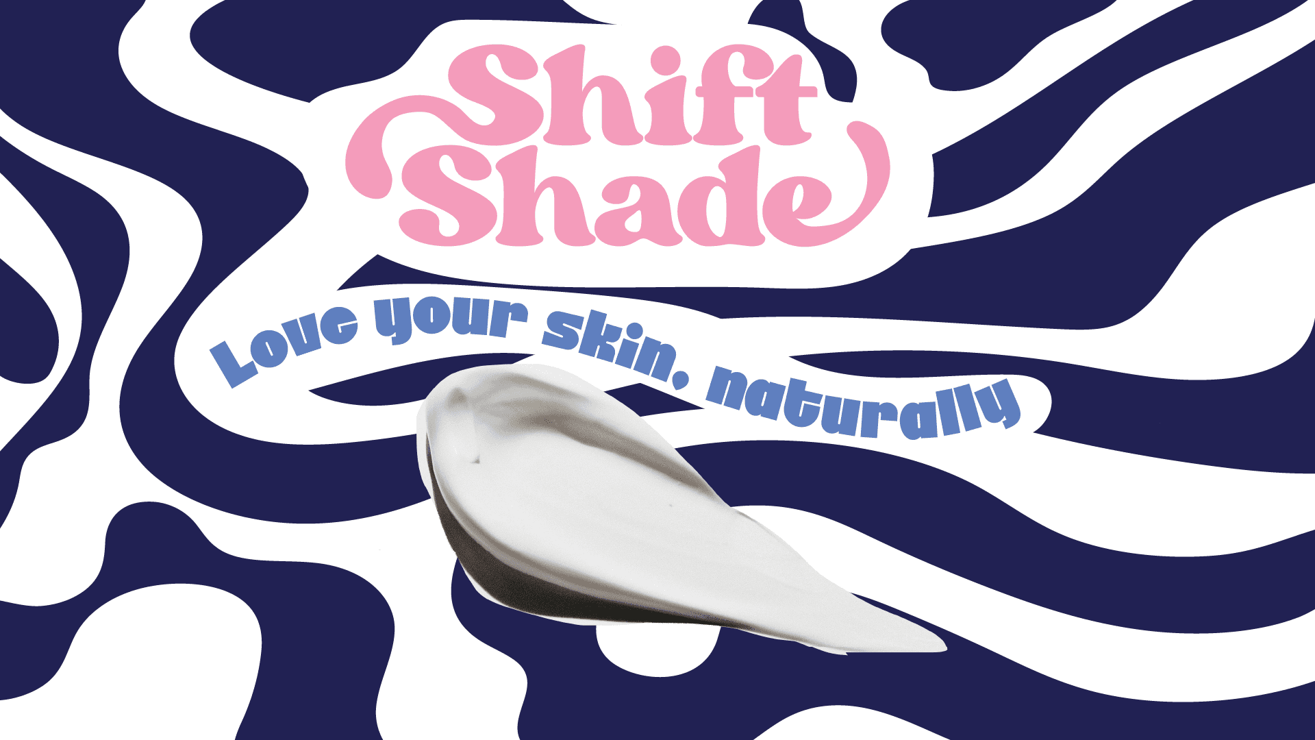
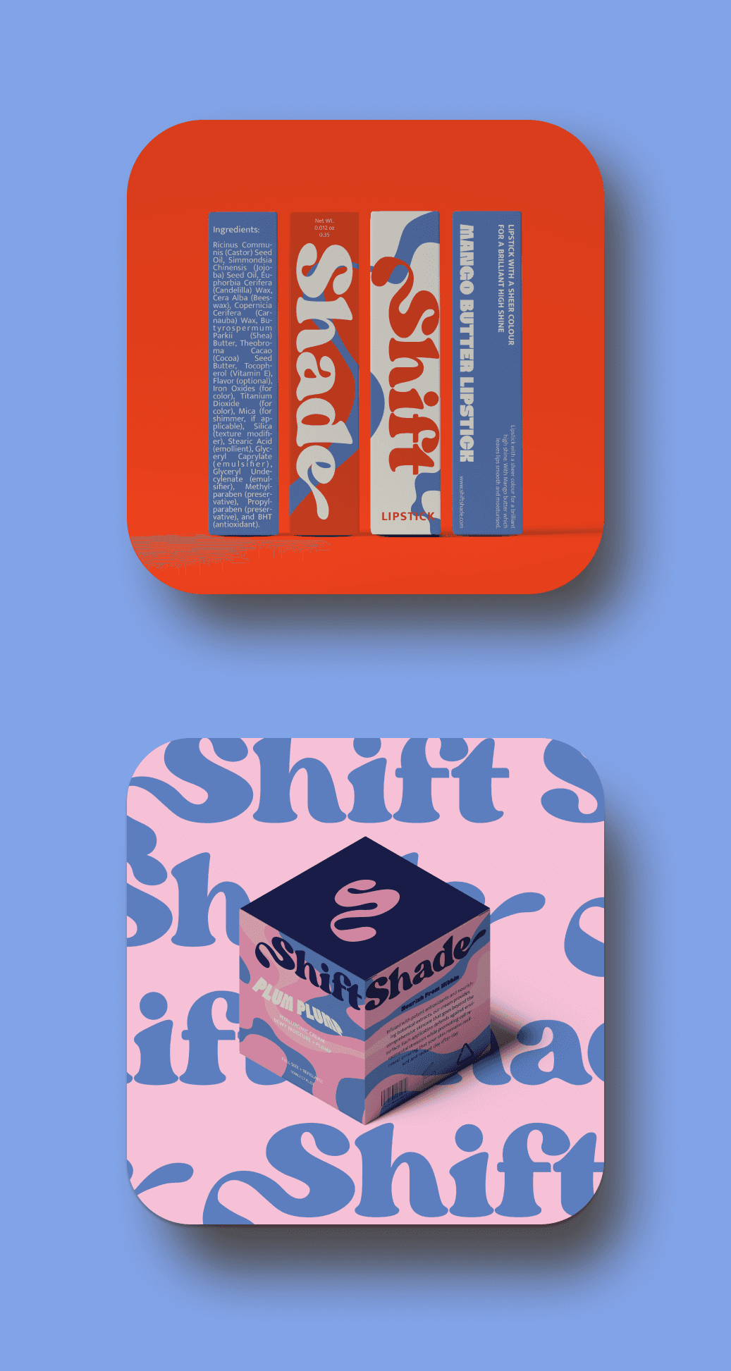
For this project, we’re creating SHIFT SHADES, a cosmetics brand that’s more than makeup—it’s a movement. Our goal is to empower Gen Z to celebrate their individuality and embrace their unique selves, one bold shade at a time.
CLIENT
CLIENT
Practice Project
SERVICE
SERVICE
Brand Identity
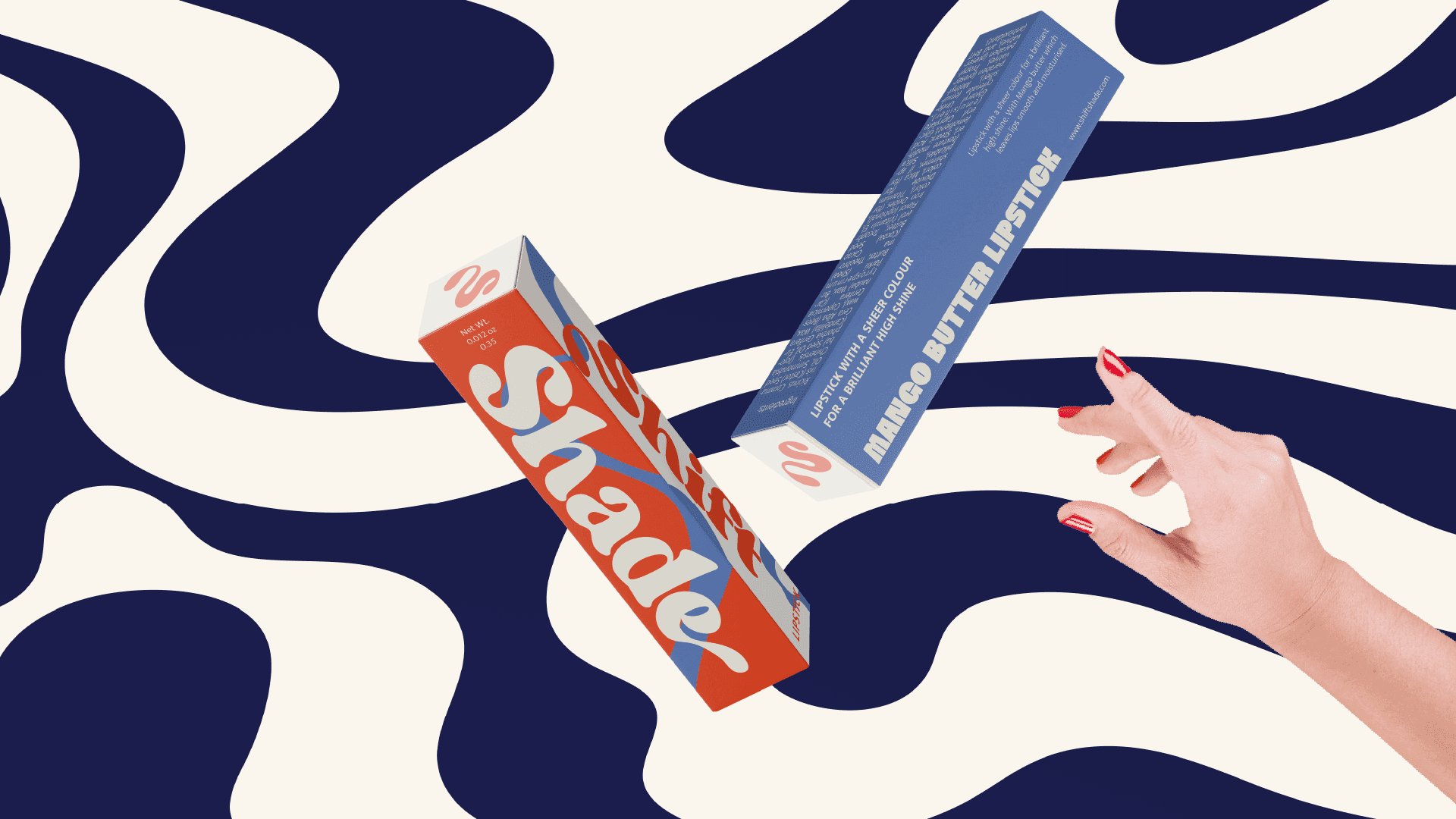
Packaging Design
INDUSTRY
INDUSTRY
Cosmetic
DURATION
DURATION
4 Weeks
Challenge & Research
Challenge & Research
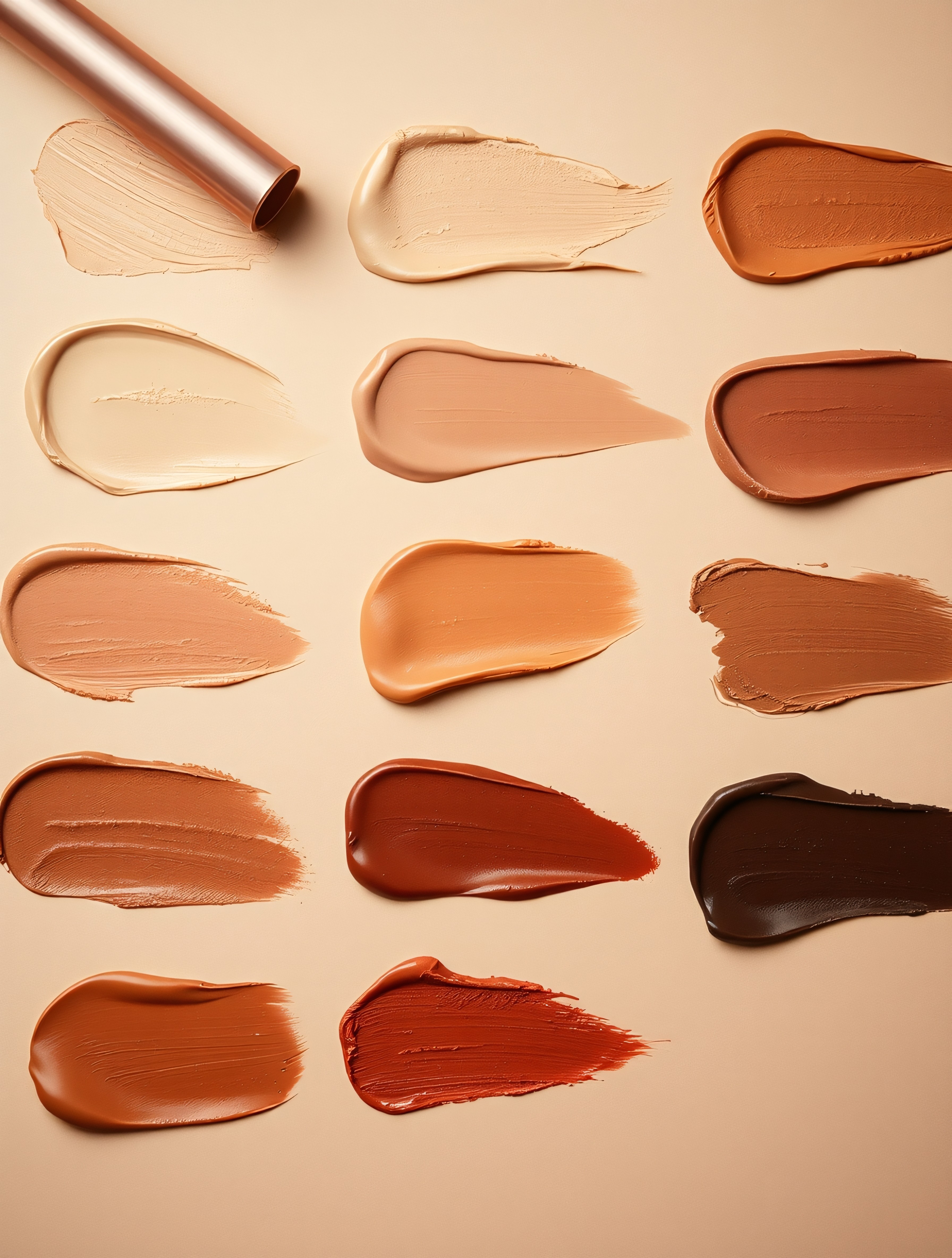
The main challenge for ShiftShade’s branding was creating a bold, fun, and inclusive identity that resonates with Gen Z while also being affordable and approachable. The brand needed to stand out in a crowded market, attract a younger audience, and convey its message of self-expression without feeling overly complex or high-end. Additionally, the design had to be flexible enough to represent a wide range of skin tones and makeup styles while keeping the playful and experimental vibe at the forefront.
The main challenge for ShiftShade’s branding was creating a bold, fun, and inclusive identity that resonates with Gen Z while also being affordable and approachable. The brand needed to stand out in a crowded market, attract a younger audience, and convey its message of self-expression without feeling overly complex or high-end. Additionally, the design had to be flexible enough to represent a wide range of skin tones and makeup styles while keeping the playful and experimental vibe at the forefront.
Solution & Design
Solution & Design
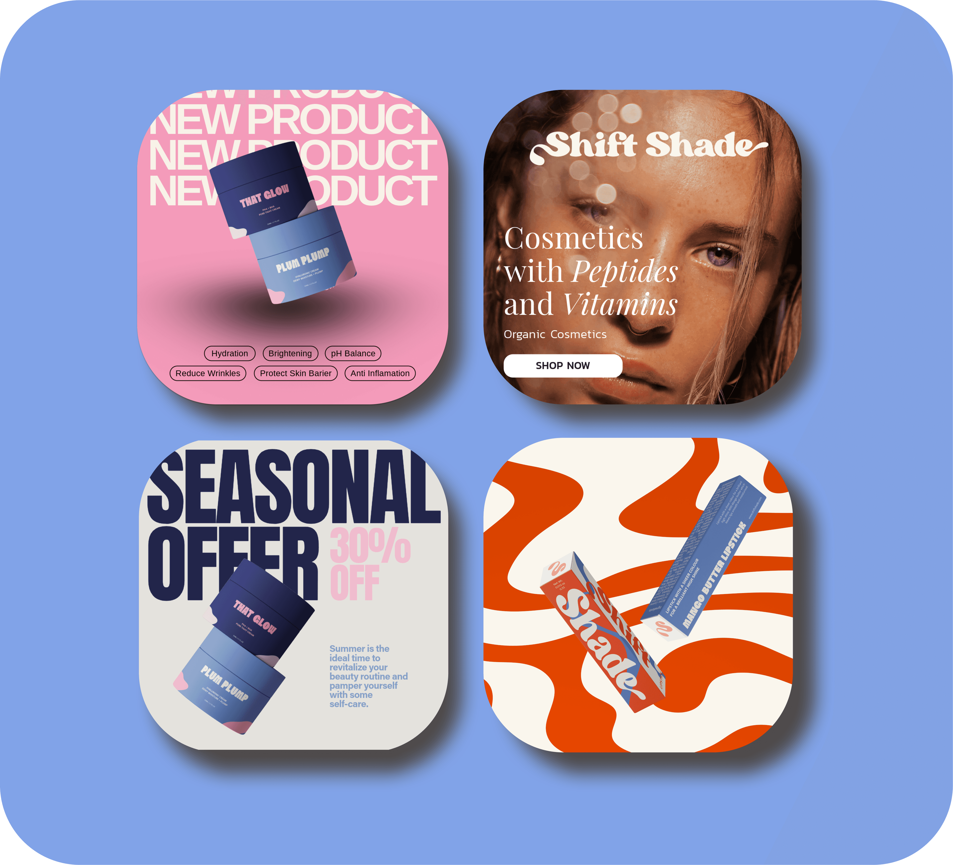
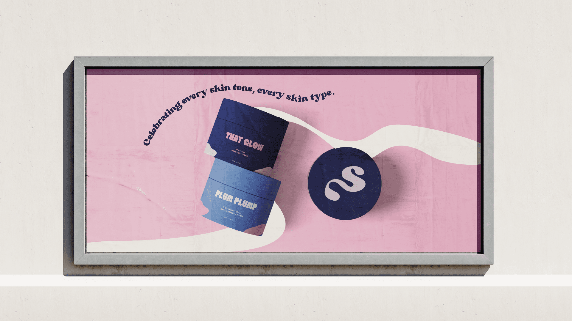
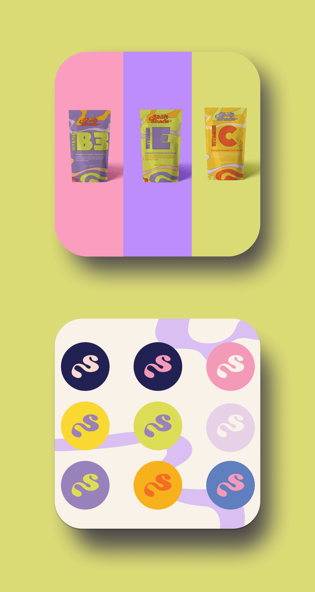
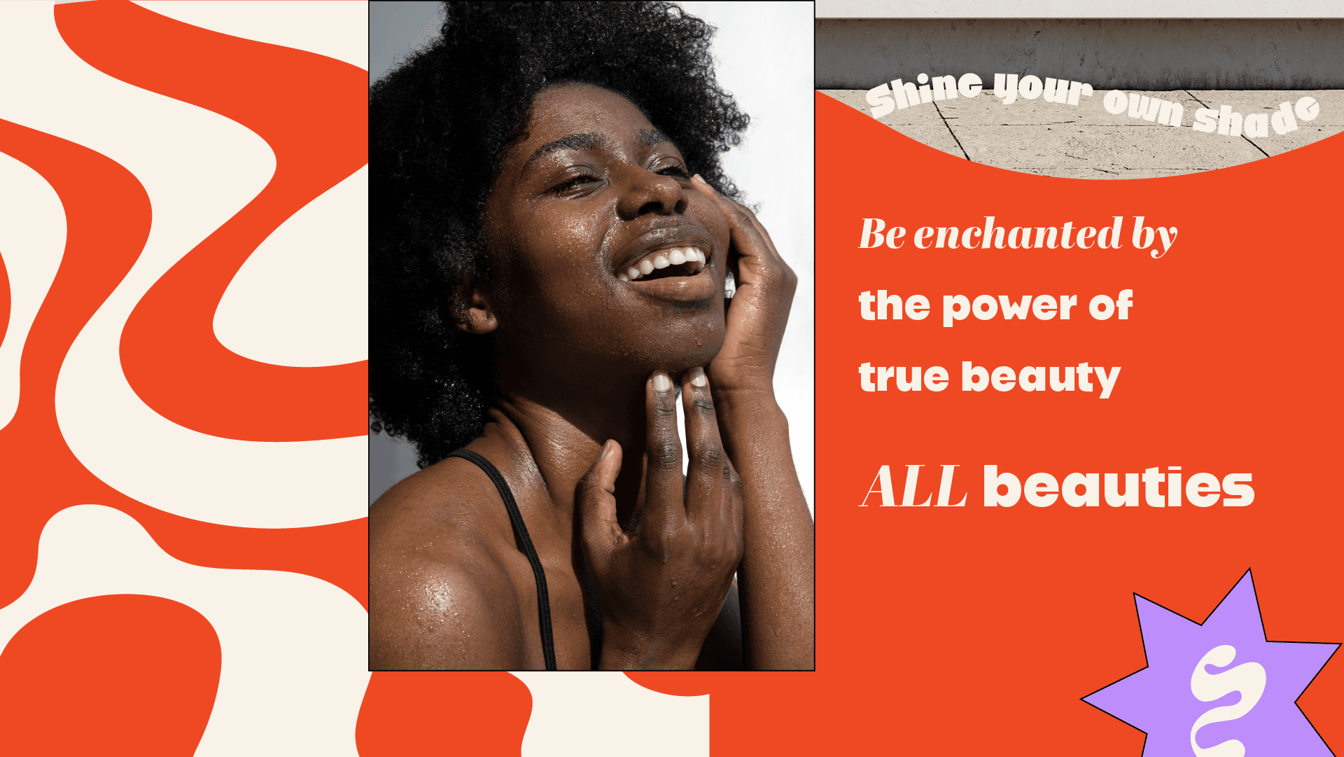
The solution was to craft a vibrant and playful visual identity that reflects the fun, bold nature of ShiftShade. Using bright colors, modern typography, and dynamic shapes, the branding feels energetic and fresh. The affordable aspect is emphasized through approachable, clean design, ensuring it’s not intimidating. The inclusion of diverse representation in both visuals and language ensures that every customer feels seen and valued. Overall, the brand’s design allows for endless creativity while staying true to its promise of self-expression, making it the go-to makeup for Gen Z.
The solution was to craft a vibrant and playful visual identity that reflects the fun, bold nature of ShiftShade. Using bright colors, modern typography, and dynamic shapes, the branding feels energetic and fresh. The affordable aspect is emphasized through approachable, clean design, ensuring it’s not intimidating. The inclusion of diverse representation in both visuals and language ensures that every customer feels seen and valued. Overall, the brand’s design allows for endless creativity while staying true to its promise of self-expression, making it the go-to makeup for Gen Z.
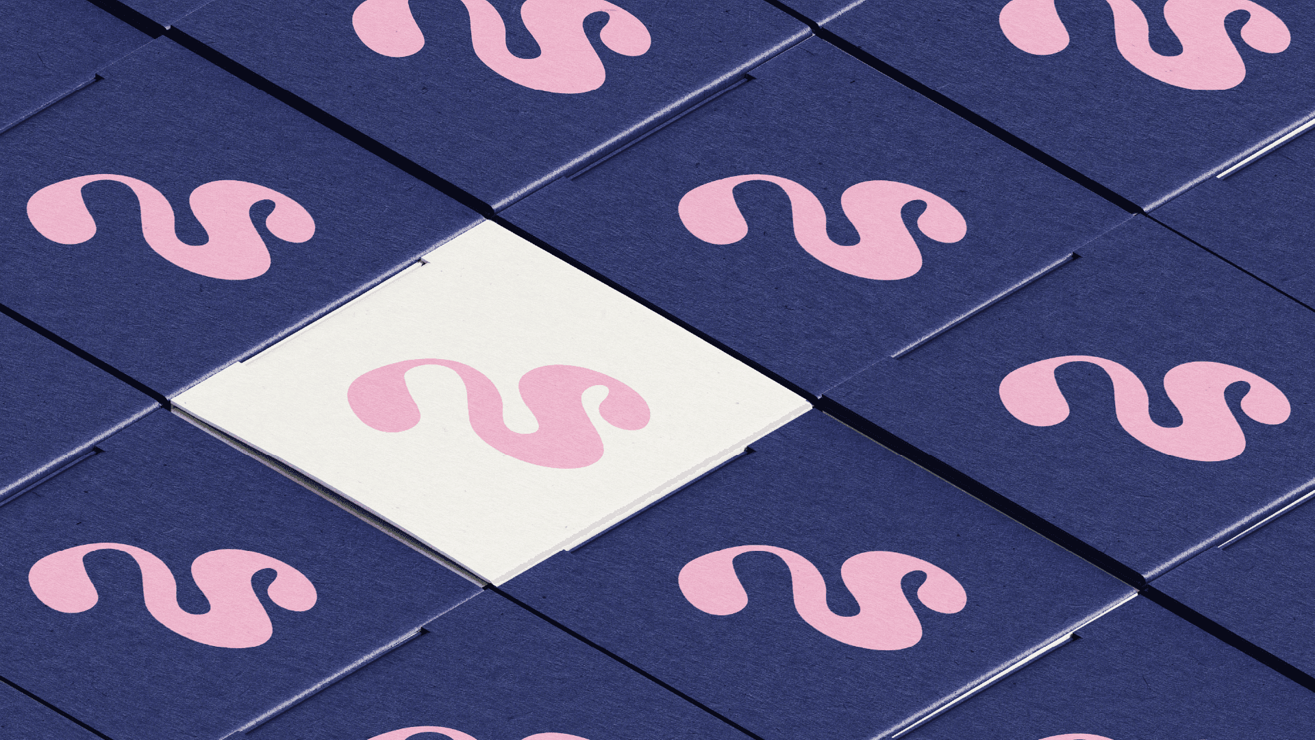

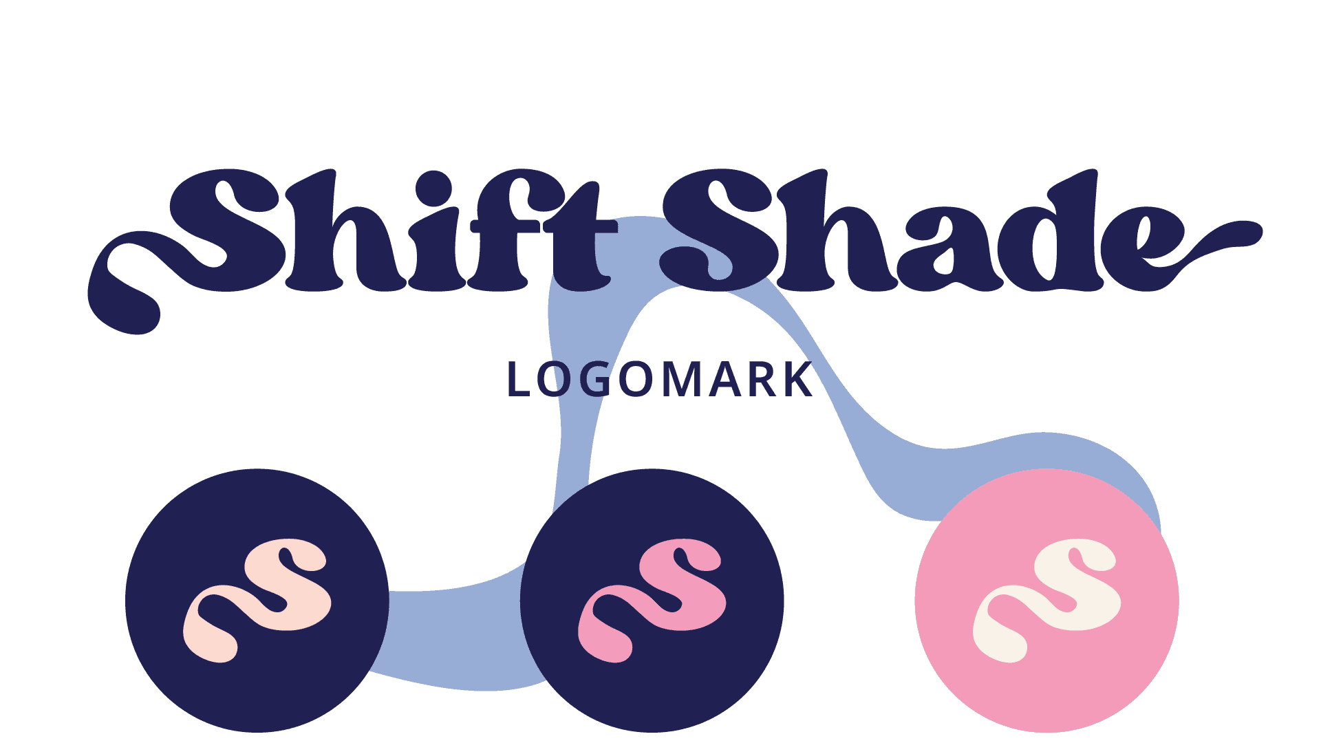
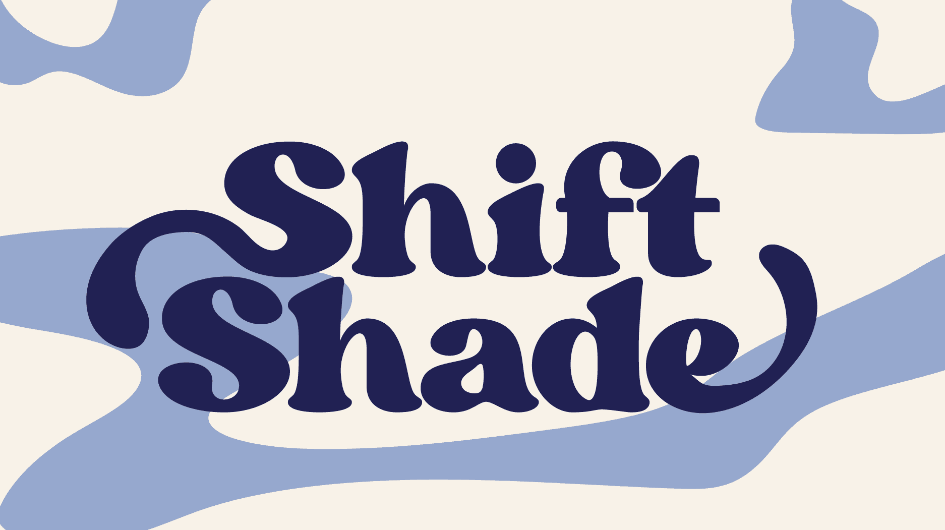
The Primary Logo
The Primary Logo



Let's Connect
( Laura Portfolio )
©2026
Let's Connect

Feel free to reach out, I'd love to hear from you
Nothing great happens solo. Let's team up and make something wonderful.
© Copyright
2026
2026
2026
Feel free to reach out, I'd love to hear from you
Nothing great happens solo. Let's team up and make something wonderful.
© Copyright
2026